Lab-03 Identifying Neighborhood Clusters
Packages
library( geojsonio ) # read shapefiles
library( sp ) # work with shapefiles
library( sf ) # work with shapefiles - simple features format
library( mclust ) # cluster analysis
library( tmap ) # theme maps
library( ggplot2 ) # graphing
library( ggthemes )
library( dplyr )
library( pander )Data Source
This exercise uses Census data from the 2012 American Communities Survey made available through the Diversity and Disparities Project.
DATA DICTIONARY
| LABEL | VARIABLE |
|---|---|
| tractid | GEOID |
| pnhwht12 | Percent white, non-Hispanic |
| pnhblk12 | Percent black, non-Hispanic |
| phisp12 | Percent Hispanic |
| pntv12 | Percent Native American race |
| pfb12 | Percent foreign born |
| polang12 | Percent speaking other language at home, age 5 plus |
| phs12 | Percent with high school degree or less |
| pcol12 | Percent with 4-year college degree or more |
| punemp12 | Percent unemployed |
| pflabf12 | Percent female labor force participation |
| pprof12 | Percent professional employees |
| pmanuf12 | Percent manufacturing employees |
| pvet12 | Percent veteran |
| psemp12 | Percent self-employed |
| hinc12 | Median HH income, total |
| incpc12 | Per capita income |
| ppov12 | Percent in poverty, total |
| pown12 | Percent owner-occupied units |
| pvac12 | Percent vacant units |
| pmulti12 | Percent multi-family units |
| mrent12 | Median rent |
| mhmval12 | Median home value |
| p30old12 | Percent structures more than 30 years old |
| p10yrs12 | Percent HH in neighborhood 10 years or less |
| p18und12 | Percent 17 and under, total |
| p60up12 | Percent 60 and older, total |
| p75up12 | Percent 75 and older, total |
| pmar12 | Percent currently married, not separated |
| pwds12 | Percent widowed, divorced and separated |
| pfhh12 | Percent female-headed families with children |
Load Phoenix Shapefile
We are using a Dorling Cartogram representation of Census tracts to remove bias.
The steps to create the cartogram are described HERE.
# dorling cartogram of Phoenix Census Tracts
github.url <- "https://raw.githubusercontent.com/DS4PS/cpp-529-master/master/data/phx_dorling.geojson"
phx <- geojson_read( x=github.url, what="sp" )
plot( phx )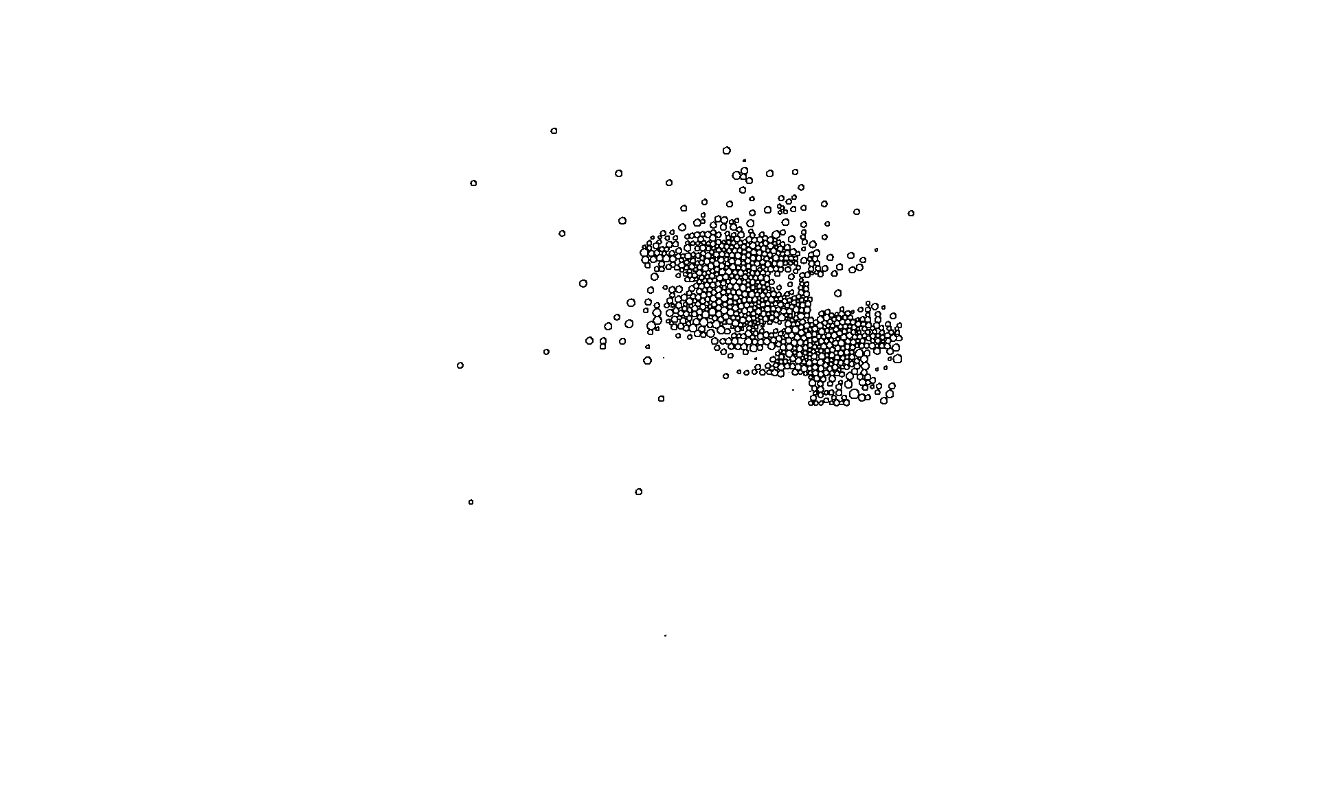
We can do better than that. Let’s take a look at the tmap package in R.
# library( tmap )
phx <- spTransform( phx, CRS("+init=epsg:3395") )
bb <- st_bbox( c( xmin = -12519146, xmax = -12421368,
ymax = 3965924, ymin = 3899074 ),
crs = st_crs("+init=epsg:3395"))
tm_shape( phx, bbox=bb ) +
tm_polygons( col="MHHI", n=10, style="quantile", palette="Spectral" ) +
tm_layout( "PHX Dorling Cartogram", title.position=c("right","top") )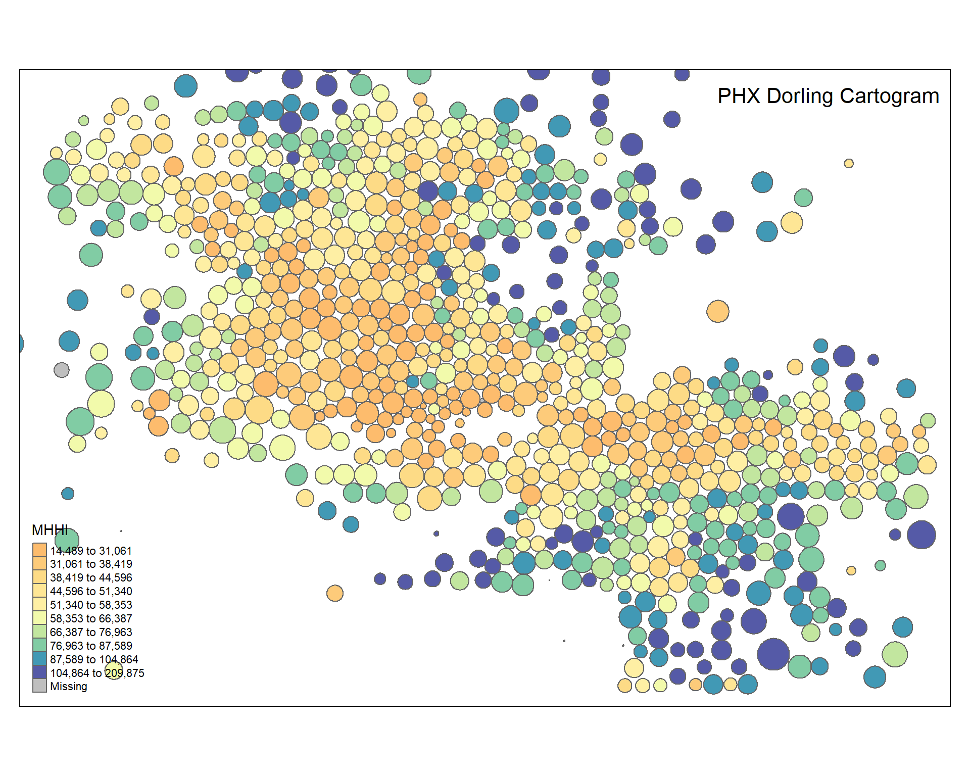
tmap_mode("view")
tm_basemap( "HikeBike.HillShading" ) +
tm_shape( phx, bbox=bb ) +
tm_polygons( col="phisp12", n=7, style="quantile", palette="-inferno" ) tm_basemap( "Stamen.Watercolor" ) +
tm_shape( phx, bbox=bb ) +
tm_polygons( col="MHHI", n=7, style="quantile", palette="RdYlBu" ) +
tm_legend( show=FALSE )Check out some useful guides or launch the palette explorer for an easy way to find great color schemes for your data.
Census Variables
This shapefile comes pre-loaded with the Census data from your first lab.
## [1] "GEOID2" "GEOID" "STATEFP" "COUNTYFP" "TRACTCE" "AFFGEOID"
## [7] "NAME" "LSAD" "ALAND" "AWATER" "POP" "MHHI"
## [13] "ID" "pop.w" "pnhwht12" "pnhblk12" "phisp12" "pntv12"
## [19] "pfb12" "polang12" "phs12" "pcol12" "punemp12" "pflabf12"
## [25] "pprof12" "pmanuf12" "pvet12" "psemp12" "hinc12" "incpc12"
## [31] "ppov12" "pown12" "pvac12" "pmulti12" "mrent12" "mhmval12"
## [37] "p30old12" "p10yrs12" "p18und12" "p60up12" "p75up12" "pmar12"
## [43] "pwds12" "pfhh12"We are going to extract the data from the shapefile and save it as a separate data frame so we can use it for analysis independent of the shapefile.
| GEOID2 | GEOID | STATEFP | COUNTYFP | TRACTCE | AFFGEOID |
|---|---|---|---|---|---|
| 4.013e+09 | 04013010101 | 04 | 013 | 010101 | 1400000US04013010101 |
| 4.013e+09 | 04013010102 | 04 | 013 | 010102 | 1400000US04013010102 |
| 4.013e+09 | 04013030401 | 04 | 013 | 030401 | 1400000US04013030401 |
| 4.013e+09 | 04013030402 | 04 | 013 | 030402 | 1400000US04013030402 |
| 4.013e+09 | 04013040502 | 04 | 013 | 040502 | 1400000US04013040502 |
| 4.013e+09 | 04013040506 | 04 | 013 | 040506 | 1400000US04013040506 |
Prepare Data for Clustering
We transform all of the variables to z scorse so they are on the same scale while clustering. This ensures that each census variable has equal weight. Z-scores typically range from about -3 to +3 with a mean of zero.
keep.these <- c("pnhwht12", "pnhblk12", "phisp12", "pntv12", "pfb12", "polang12",
"phs12", "pcol12", "punemp12", "pflabf12", "pprof12", "pmanuf12",
"pvet12", "psemp12", "hinc12", "incpc12", "ppov12", "pown12",
"pvac12", "pmulti12", "mrent12", "mhmval12", "p30old12", "p10yrs12",
"p18und12", "p60up12", "p75up12", "pmar12", "pwds12", "pfhh12")
d2 <- select( d1, keep.these )
d3 <- apply( d2, 2, scale )
head( d3[,1:6] ) %>% pander()| pnhwht12 | pnhblk12 | phisp12 | pntv12 | pfb12 | polang12 |
|---|---|---|---|---|---|
| 1.382 | -0.8508 | -1.038 | -0.2962 | -0.6524 | -0.9802 |
| 1.358 | -0.8508 | -1.125 | -0.22 | -0.1142 | -0.6567 |
| 1.533 | -0.8508 | -1.153 | -0.2962 | -0.7297 | -1.201 |
| 1.24 | -0.8508 | -1.058 | -0.1715 | -0.8447 | -0.9941 |
| 1.054 | -0.6265 | -0.7904 | -0.1733 | -0.7813 | -0.8673 |
| 1.535 | -0.8472 | -1.168 | -0.2962 | -0.8854 | -1.101 |
Perform Cluster Analysis
For more details on cluster analysis visit the mclust tutorial.
# library( mclust )
set.seed( 1234 )
fit <- Mclust( d3 )
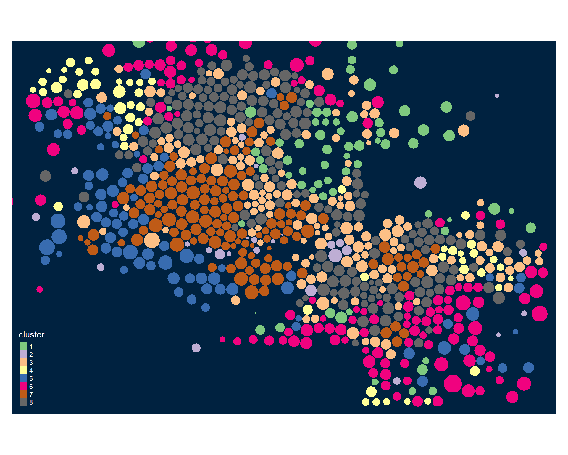
phx$cluster <- as.factor( fit$classification )
summary( fit )## ----------------------------------------------------
## Gaussian finite mixture model fitted by EM algorithm
## ----------------------------------------------------
##
## Mclust VVE (ellipsoidal, equal orientation) model with 8 components:
##
## log-likelihood n df BIC ICL
## -16327.92 913 922 -38940.87 -39010.66
##
## Clustering table:
## 1 2 3 4 5 6 7 8
## 76 33 165 57 95 154 148 185Some visuals of model fit statistics (doesn’t work well with a lot of variables):
# dropping two tracts that cover the legend
phx2 <- phx[ !(phx$GEOID %in% c("04013723308","04013723304")) , ]
tmap_mode("plot")
tmap_style("cobalt")
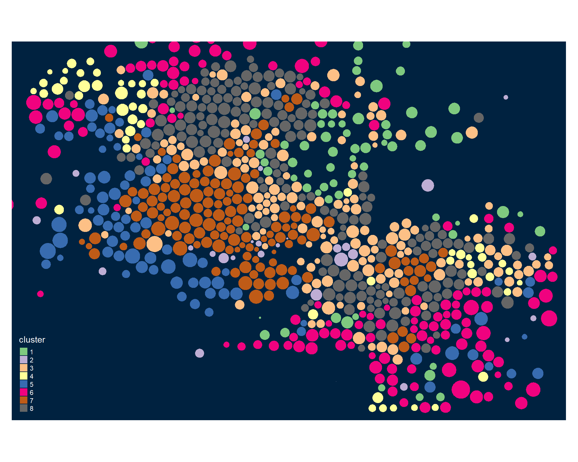
tm_shape( phx2, bbox=bb ) +
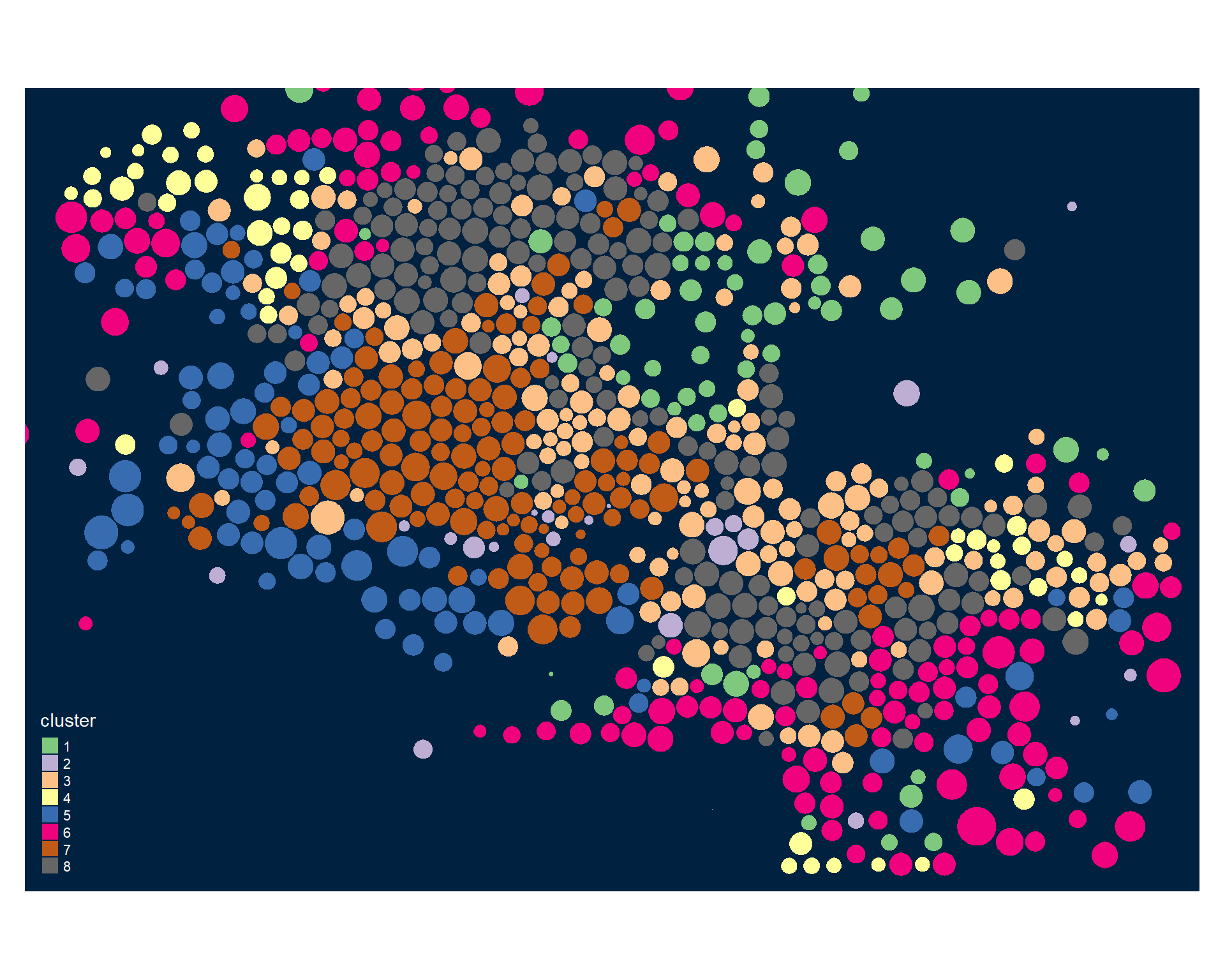
tm_polygons( col="cluster", palette="Accent" )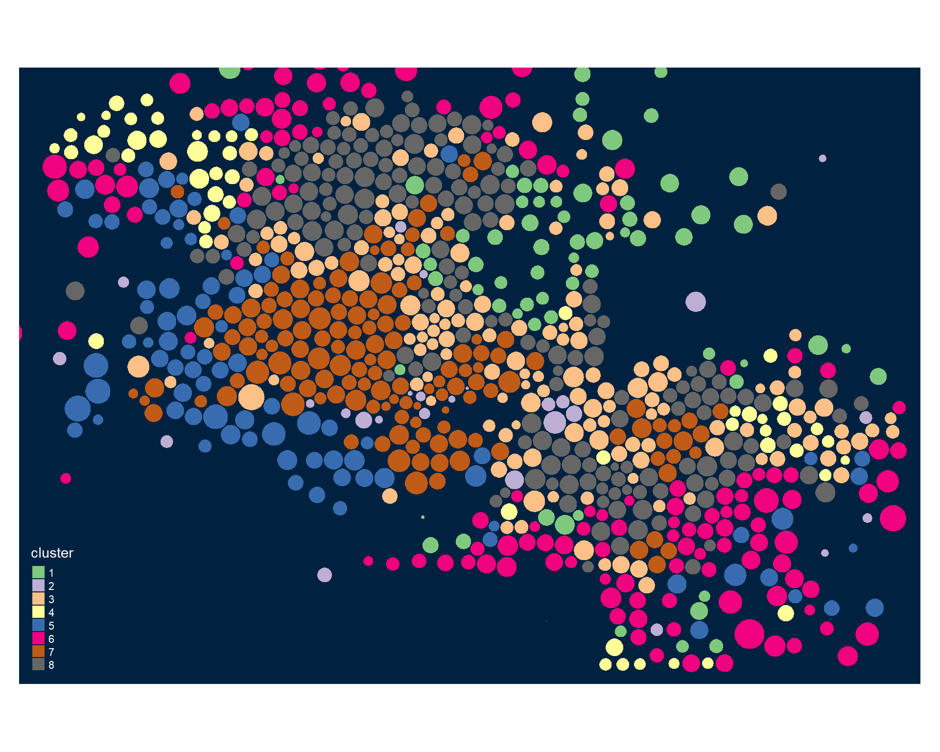
Identifying Neighborhood Clusters
Ok, so we have a pretty map now, but what does it mean? Let’s look at our clusters.
We can split our data up by the 8 distinct clusters and look at characteristics of each.
Let’s start by looking at how one of our 30 census variables varies by group:
# library( ggplot2 )
# library( ggthemes )
# table( d2$cluster ) # number of tracts in each group
d2$cluster <- d2$cluster <- as.factor( paste0("GROUP-",fit$classification) )
ggplot( d2, aes( x=phisp12 ) ) +
geom_density( alpha = 0.5, fill="blue" ) + # xlim( -3, 3 ) +
xlab( "Percent Hispanic" ) + facet_wrap( ~ cluster, nrow=2 ) + theme_minimal()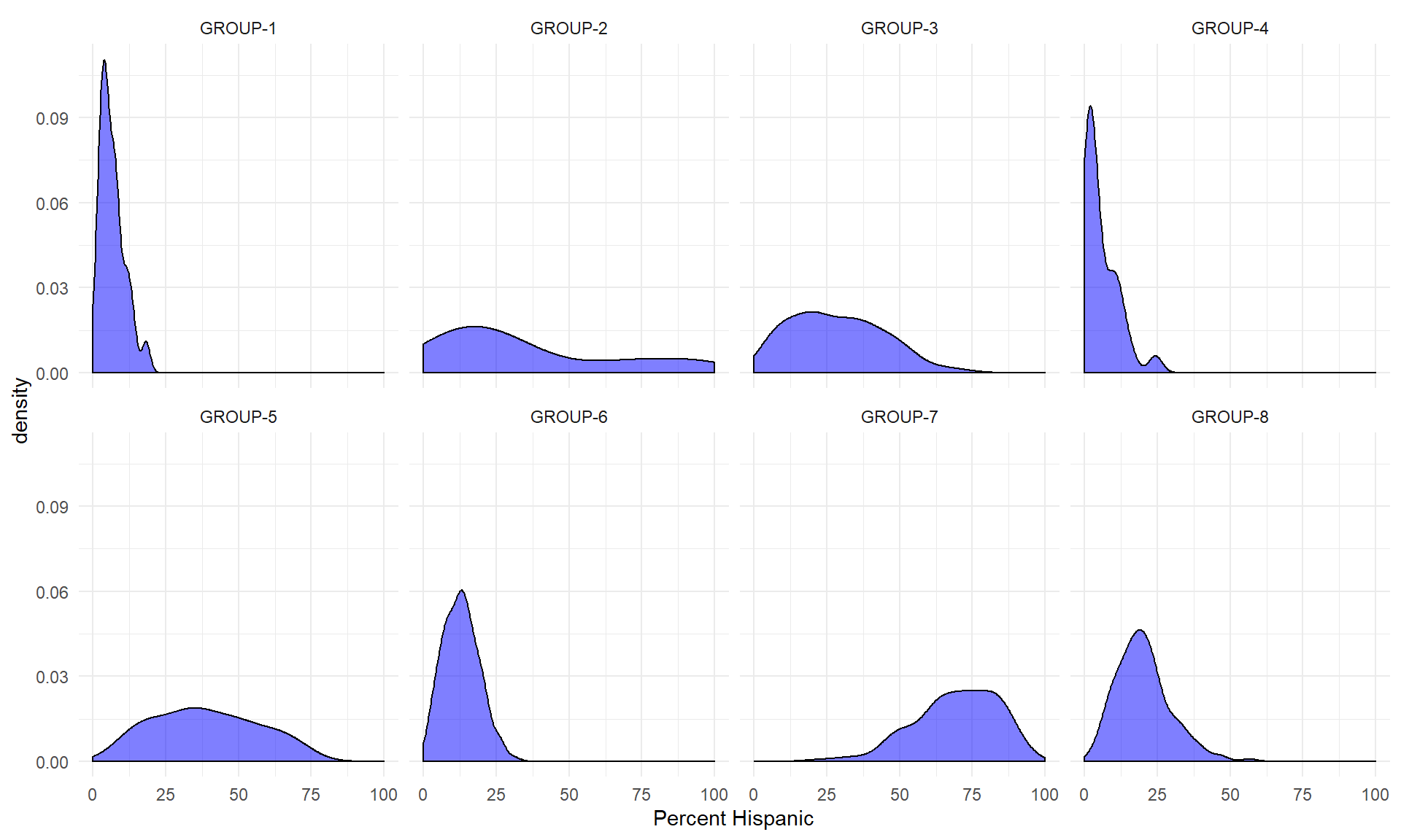
We can see that some groups (neighborhood clusters) have a high proportion of Hispanic residents, while others have almost none. That is a good sign - it means the clustering appears to be meaningful in the sense that it identifies differences between the groups.
Let’s look at one more.
ggplot( d2, aes( x=pcol12) ) +
geom_density( alpha = 0.5, fill="blue" ) + # xlim( -3, 3 ) +
xlab( "Percent with a College Degree" ) + facet_wrap( ~ cluster, nrow=2 ) + theme_minimal()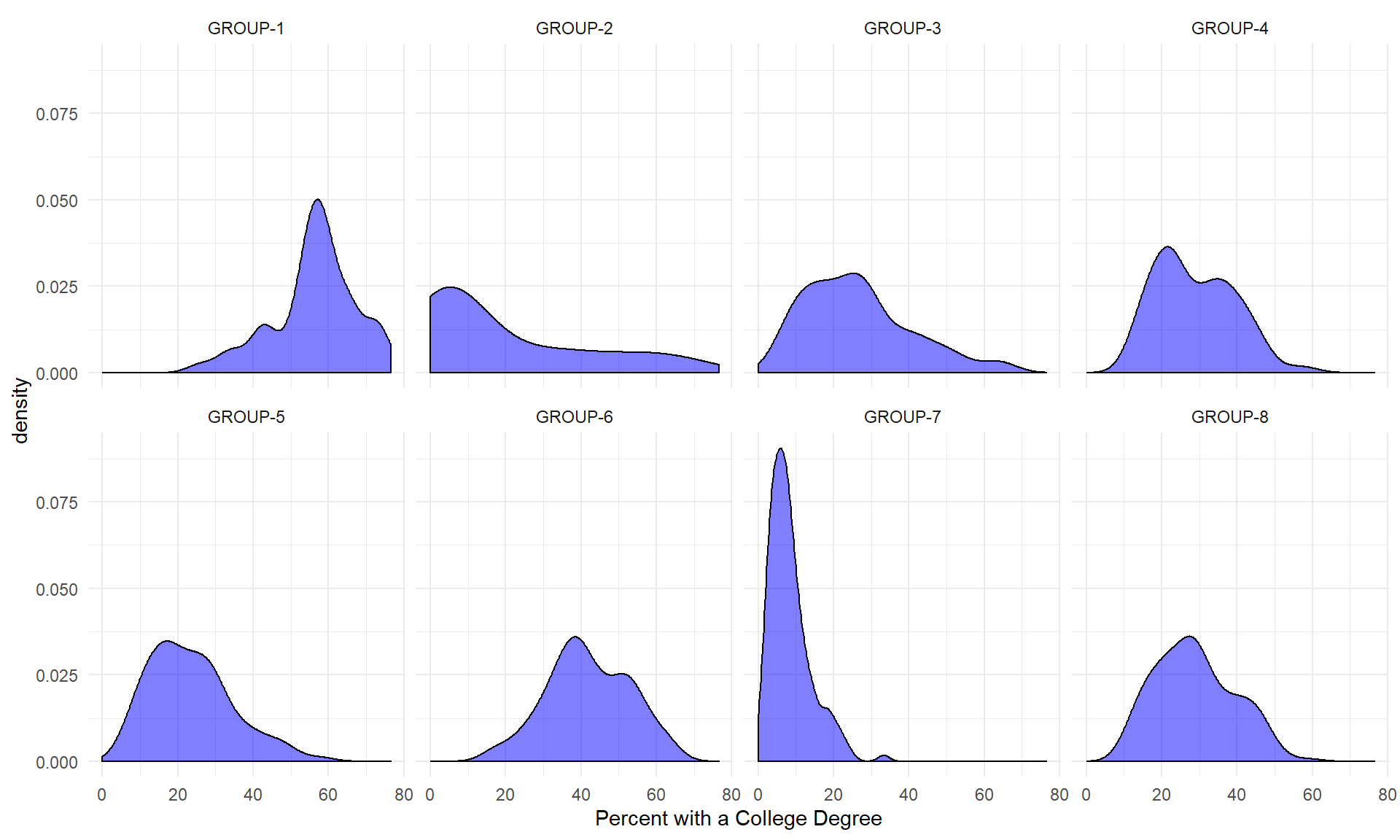
We can see that lots of clusters have between 20 and 40 percent with college degrees. Group 1 has an extremely high proportion, and Group 7 has an extremely low proportion.
df.pct <- sapply( d2, ntile, 100 )
d3 <- as.data.frame( df.pct )
d3$cluster <- as.factor( paste0("GROUP-",fit$classification) )
stats <-
d3 %>%
group_by( cluster ) %>%
summarise_each( funs(mean) )
t <- data.frame( t(stats), stringsAsFactors=F )
names(t) <- paste0( "GROUP.", 1:8 )
t <- t[-1,]
for( i in 1:8 )
{
z <- t[,i]
plot( rep(1,30), 1:30, bty="n", xlim=c(-75,100),
type="n", xaxt="n", yaxt="n",
xlab="Percentile", ylab="",
main=paste("GROUP",i) )
abline( v=seq(0,100,25), lty=3, lwd=1.5, col="gray90" )
segments( y0=1:30, x0=0, x1=100, col="gray70", lwd=2 )
text( -0.2, 1:30, data.dictionary$VARIABLE[-1], cex=0.85, pos=2 )
points( z, 1:30, pch=19, col="firebrick", cex=1.5 )
axis( side=1, at=c(0,50,100), col.axis="gray", col="gray" )
}
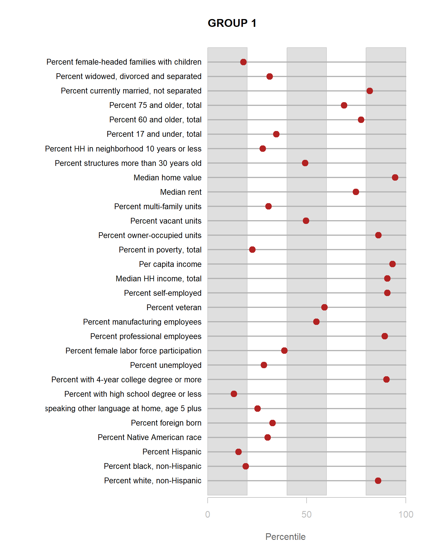
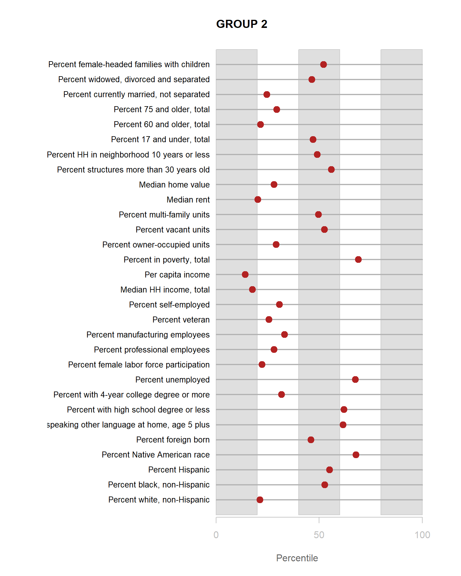
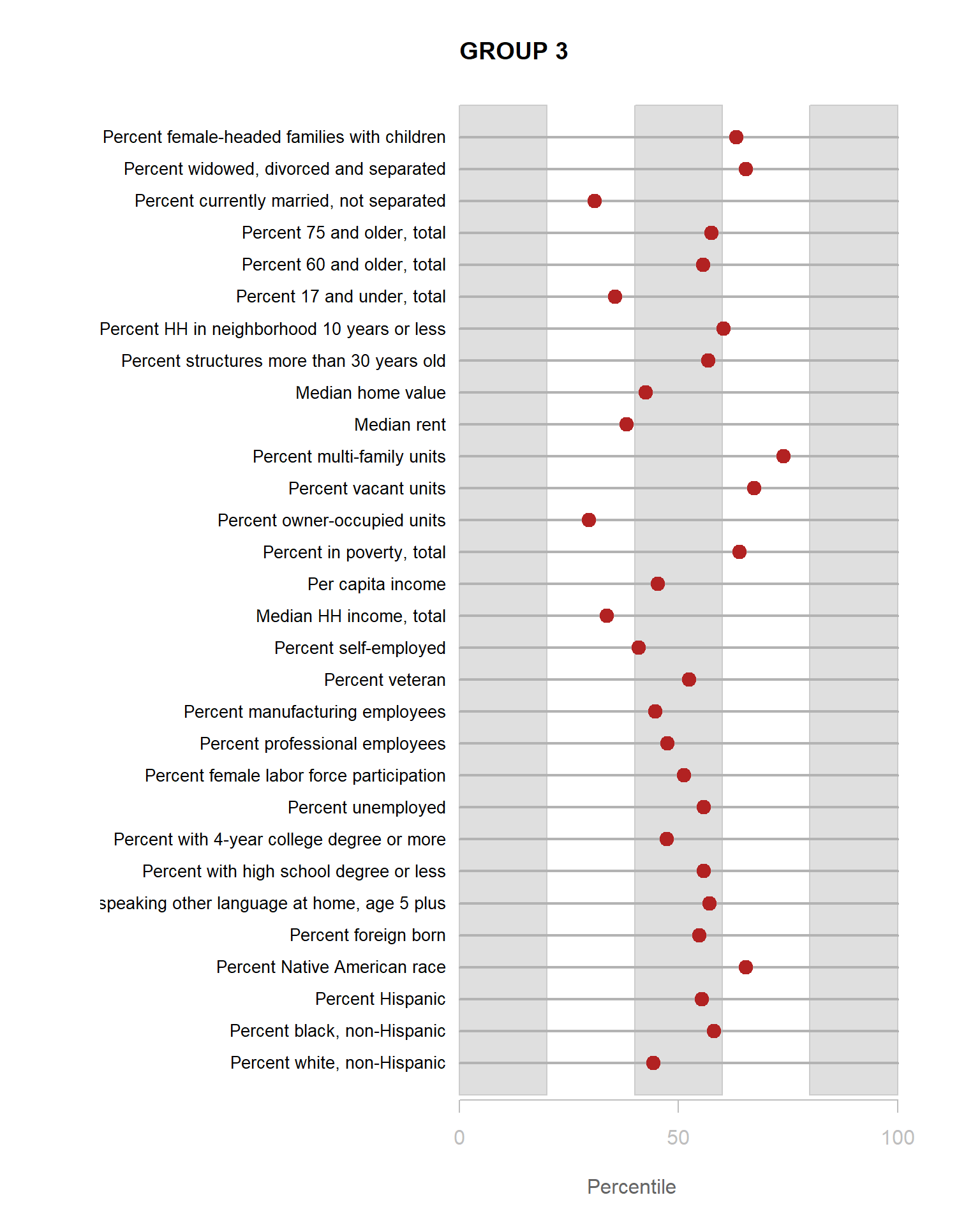
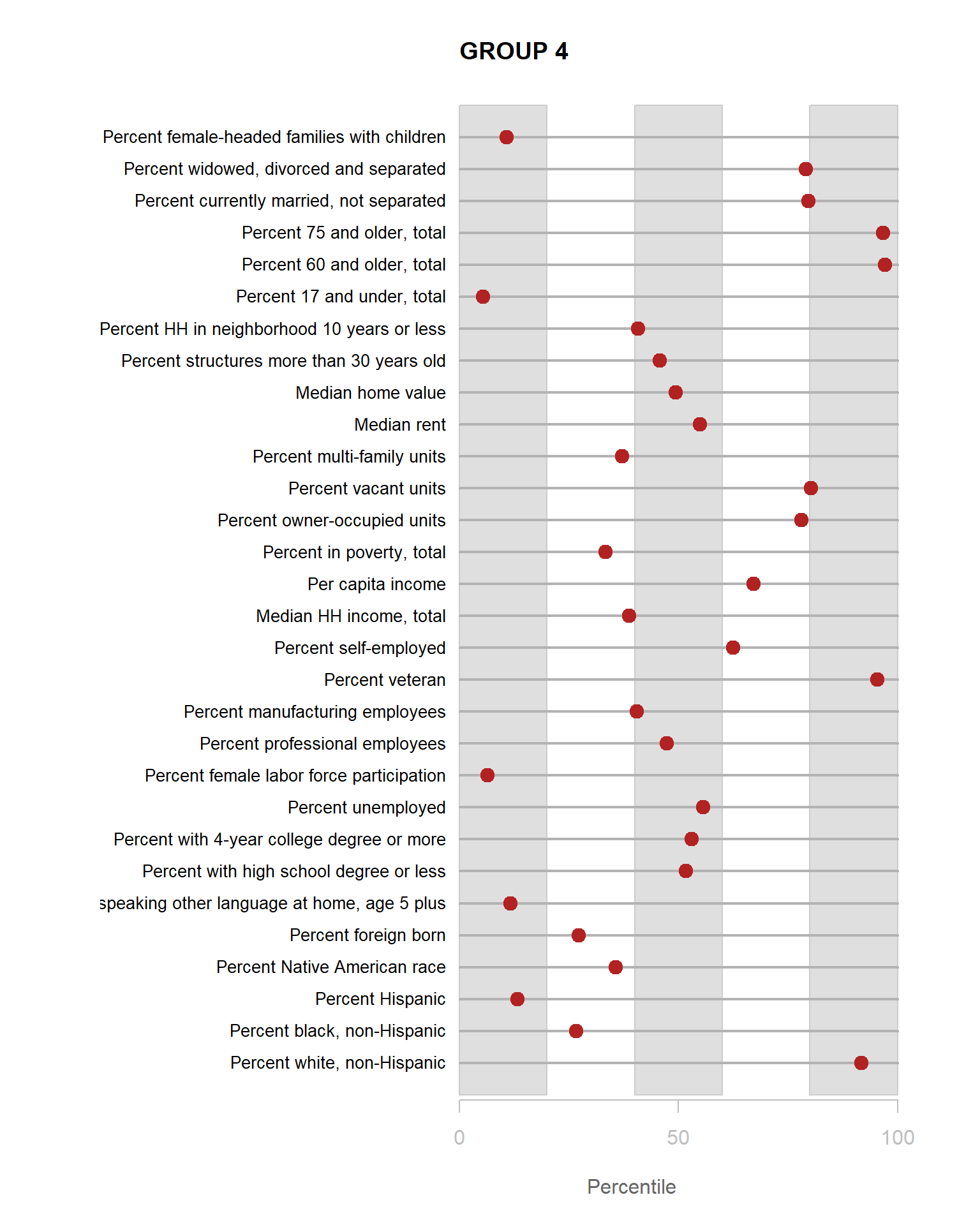
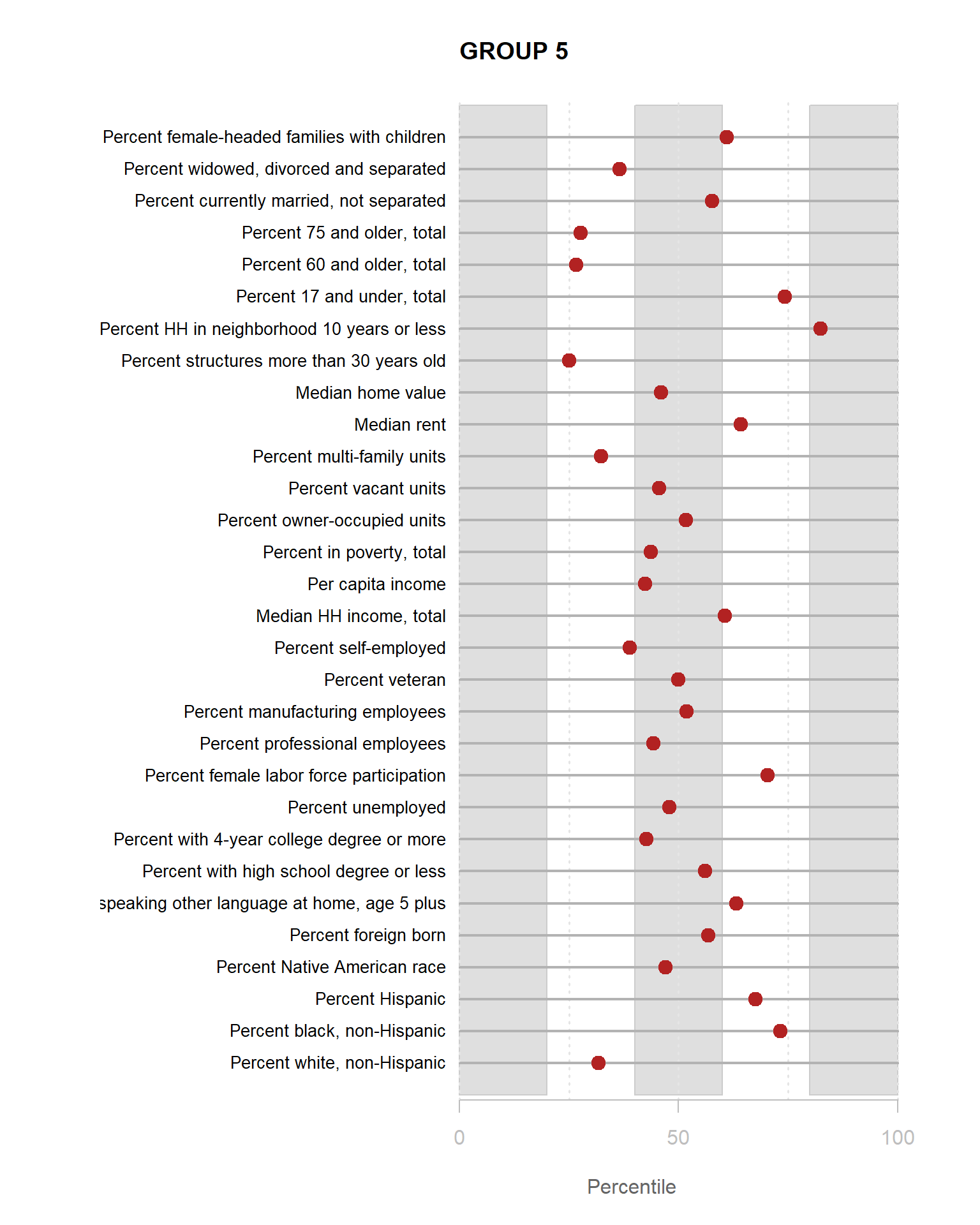
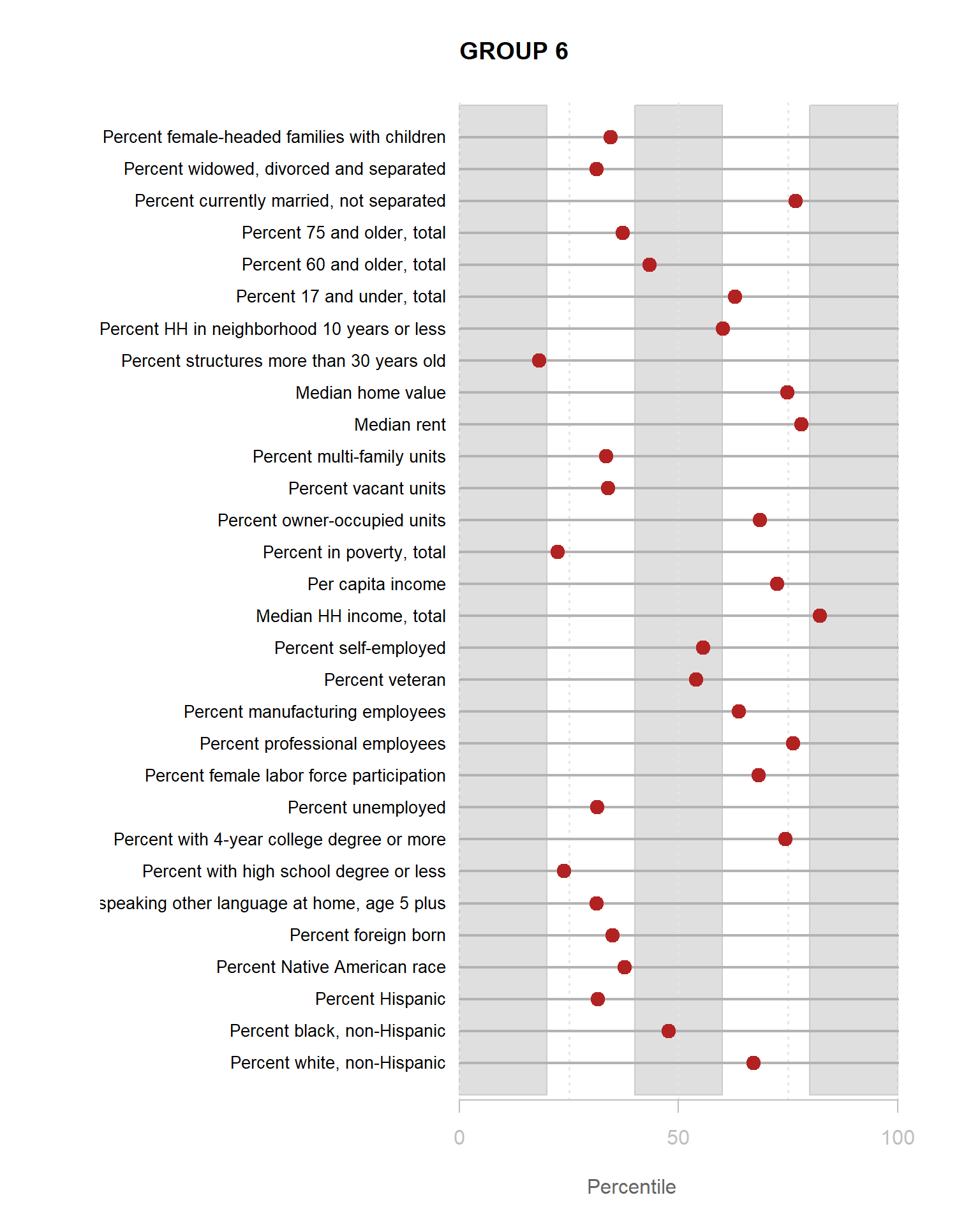
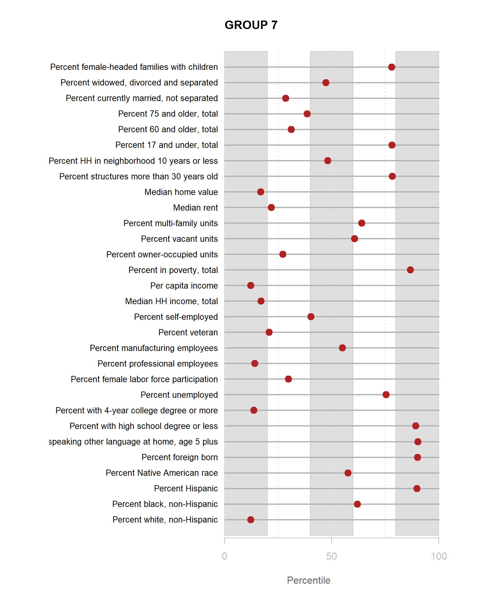
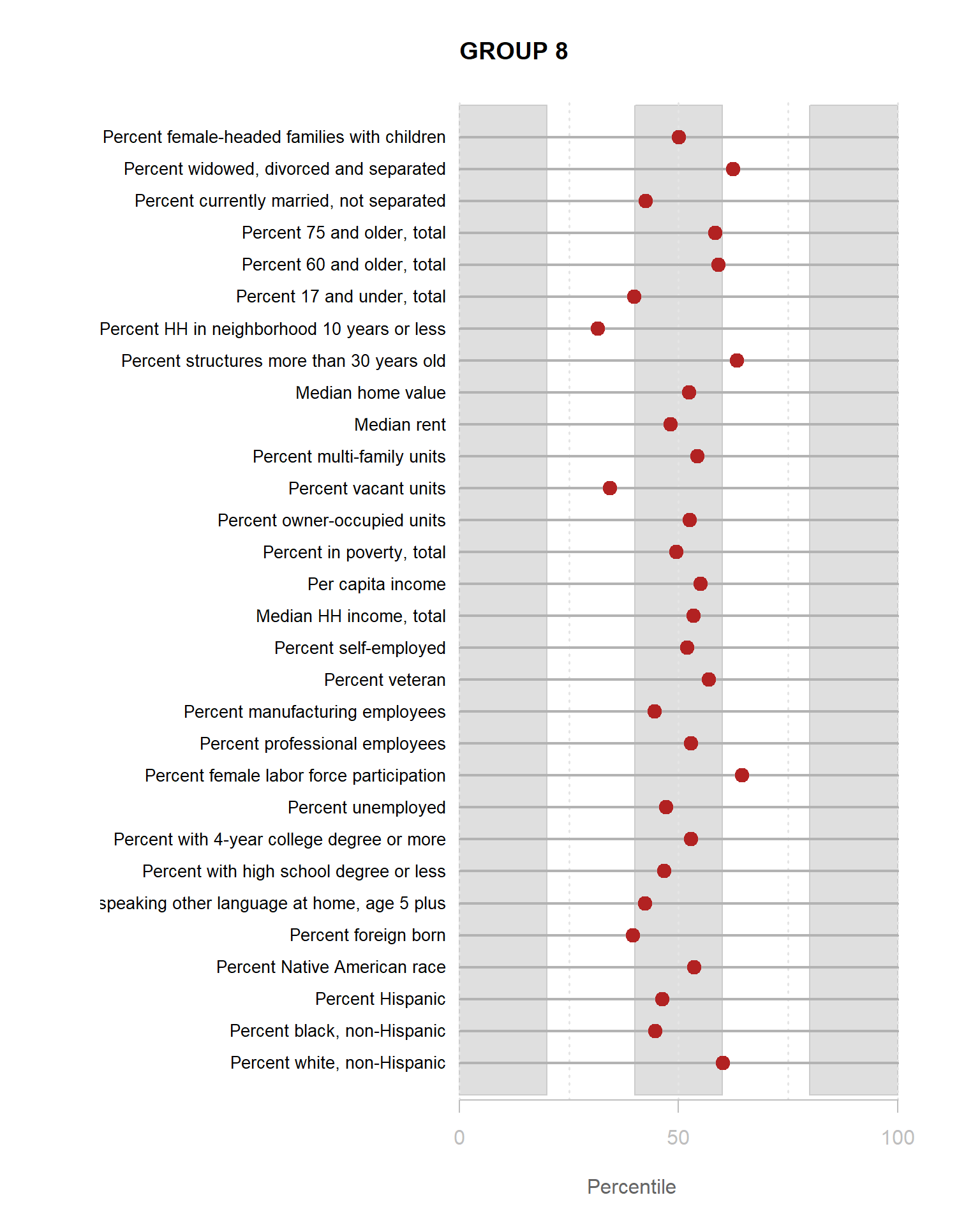
You are now ready to identify meaningful labels for your clusters.
For the YellowDig discussion this week propose labels for Groups 1-8 based upon these characteristics. A good label will be catchy and descriptive of the population within the neighborhood cluster.
Submission Instructions
After you have completed your lab submit via Canvas. Login to the ASU portal at http://canvas.asu.edu and navigate to the assignments tab in the course repository. Upload your RMD and your HTML files to the appropriate lab submission link. Or else use the link from the Schedule page.
Remember to name your files according to the convention: Lab-##-LastName.xxx
Auxiliary Functions
Create Census Var Levels by Clustering Groups
Note these produce plots reporting percentiles for each census variable, not percents.
# list variables for clustering
use.these <- c("pnhwht12", "pnhblk12", "phisp12", "pntv12", "pfb12", "polang12",
"phs12", "pcol12", "punemp12", "pflabf12", "pprof12", "pmanuf12",
"pvet12", "psemp12", "hinc12", "incpc12", "ppov12", "pown12",
"pvac12", "pmulti12", "mrent12", "mhmval12", "p30old12", "p10yrs12",
"p18und12", "p60up12", "p75up12", "pmar12", "pwds12", "pfhh12")
df <- phx@data # extract data frame from spatial sp object
model.dat <- select( df, use.these ) # select census variables for clustering
model.dat.scaled <- apply( model.dat, 2, scale ) # transform raw measures into z scores
# library( mclust )
fit <- Mclust( model.dat.scaled )
group.ids <- as.character( fit$classification )
# data.dictionary must have "LABEL" for var name and "VARIABLE" for description
view_cluster_data <- function( model.dat, group.ids, data.dictionary )
{
num.groups <- length( unique( as.character( group.ids ) ) )
num.vars <- ncol( model.dat )
data.dictionary <- data.dictionary[ data.dictionary$LABEL %in% use.these , ]
df.ntile <- sapply( model.dat, ntile, 100 )
df.ntile <- as.data.frame( df.ntile )
df.ntile$cluster <- as.factor( paste0("GROUP-", group.ids ) )
stats <-
df.ntile %>%
group_by( cluster ) %>%
summarise_each( funs(mean) )
df.stats <- data.frame( t(stats), stringsAsFactors=F )
names(df.stats) <- paste0( "GROUP.", 1:num.groups )
df.stats <- df.stats[-1,]
for( i in 1:num.groups )
{
z <- df.stats[,i]
print({
plot( rep(1,num.vars), 1:num.vars, bty="n", xlim=c(-75,100),
type="n", xaxt="n", yaxt="n",
xlab="Percentile",
ylab="", col.lab="gray40",
main=paste( "GROUP", i ) )
rect( xleft=0, ybottom=0, xright=20, ytop=(num.vars+1), col=gray(0.75,0.5), border="gray80" )
rect( xleft=40, ybottom=0, xright=60, ytop=(num.vars+1), col=gray(0.75,0.5), border="gray80" )
rect( xleft=80, ybottom=0, xright=100, ytop=(num.vars+1), col=gray(0.75,0.5), border="gray80" )
abline( v=seq(0,100,25), lty=3, lwd=1.5, col="gray90" )
segments( y0=1:num.vars, x0=0, x1=100, col="gray70", lwd=2 )
text( -0.2, 1:num.vars, data.dictionary$VARIABLE, cex=0.85, pos=2 )
points( z, 1:num.vars, pch=19, col="firebrick", cex=1.5 )
axis( side=1, at=c(0,50,100), col.axis="gray", col="gray" )
}) # end print
} # end loop
}
par( mfrow=c(4,2) )
view_cluster_data( model.dat=model.dat,
group.ids=group.ids,
data.dictionary=data.dictionary )## [1] 0 50 100## [1] 0 50 100## [1] 0 50 100## [1] 0 50 100## [1] 0 50 100## [1] 0 50 100## [1] 0 50 100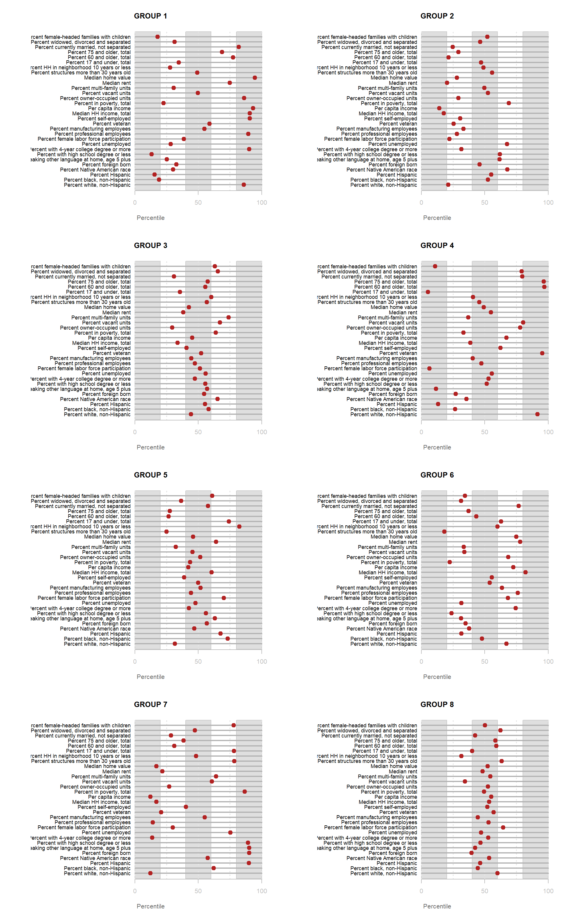
## [1] 0 50 100DATA DICTIONARY
This exercise uses Census data from the 2012 American Communities Survey made available through the Diversity and Disparities Project.
dd.URL <- "https://raw.githubusercontent.com/DS4PS/cpp-529-master/master/data/data-dictionary.csv"
data.dictionary <- read.csv( dd.URL, stringsAsFactors=F )
data.dictionary %>% pander()| LABEL | VARIABLE |
|---|---|
| tractid | GEOID |
| pnhwht12 | Percent white, non-Hispanic |
| pnhblk12 | Percent black, non-Hispanic |
| phisp12 | Percent Hispanic |
| pntv12 | Percent Native American race |
| pfb12 | Percent foreign born |
| polang12 | Percent speaking other language at home, age 5 plus |
| phs12 | Percent with high school degree or less |
| pcol12 | Percent with 4-year college degree or more |
| punemp12 | Percent unemployed |
| pflabf12 | Percent female labor force participation |
| pprof12 | Percent professional employees |
| pmanuf12 | Percent manufacturing employees |
| pvet12 | Percent veteran |
| psemp12 | Percent self-employed |
| hinc12 | Median HH income, total |
| incpc12 | Per capita income |
| ppov12 | Percent in poverty, total |
| pown12 | Percent owner-occupied units |
| pvac12 | Percent vacant units |
| pmulti12 | Percent multi-family units |
| mrent12 | Median rent |
| mhmval12 | Median home value |
| p30old12 | Percent structures more than 30 years old |
| p10yrs12 | Percent HH in neighborhood 10 years or less |
| p18und12 | Percent 17 and under, total |
| p60up12 | Percent 60 and older, total |
| p75up12 | Percent 75 and older, total |
| pmar12 | Percent currently married, not separated |
| pwds12 | Percent widowed, divorced and separated |
| pfhh12 | Percent female-headed families with children |
Helper Plots
pdf( "interpretting-clusters.pdf" )
tmap_style("cobalt")
tm_shape( phx2, bbox=bb ) +
tm_polygons( col="cluster", palette="Accent" )
for( i in 1:8 )
{
z <- t[,i]
plot( rep(1,30), 1:30, bty="n", xlim=c(-75,100),
type="n", xaxt="n", yaxt="n",
xlab="Percentile", ylab="",
main=paste("GROUP",i) )
abline( v=seq(0,100,25), lty=3, lwd=1.5, col="gray90" )
segments( y0=1:30, x0=0, x1=100, col="gray70", lwd=2 )
text( -0.2, 1:30, data.dictionary$VARIABLE[-1], cex=0.65, pos=2 )
# points( q50, 1:30, pch="|", cex=0.8, col="gray" )
points( z, 1:30, pch=19, col="firebrick", cex=1.5 )
axis( side=1, at=c(0,50,100), col.axis="gray", col="gray" )
}
dev.off()d2 <- as.data.frame( d2 )
d2$cluster <- as.factor( paste0("GROUP-",fit$classification) )
pdf( "cluster-density-plots.pdf" )
these <- names(d2)
these <- these[ -length(these) ]
for( i in these )
{
graph.label <-
data.dictionary$VARIABLE[ data.dictionary$LABEL == i ] %>%
as.character()
p <-
ggplot( d2, aes( x=get(i) ) ) +
geom_density( alpha = 0.5, fill="blue" ) + # xlim( -3, 3 ) +
xlab( graph.label ) + facet_wrap( ~ cluster, nrow=2 ) + theme_minimal()
print( p )
}
dev.off()